Julive, Charlotte's first center-city festival.
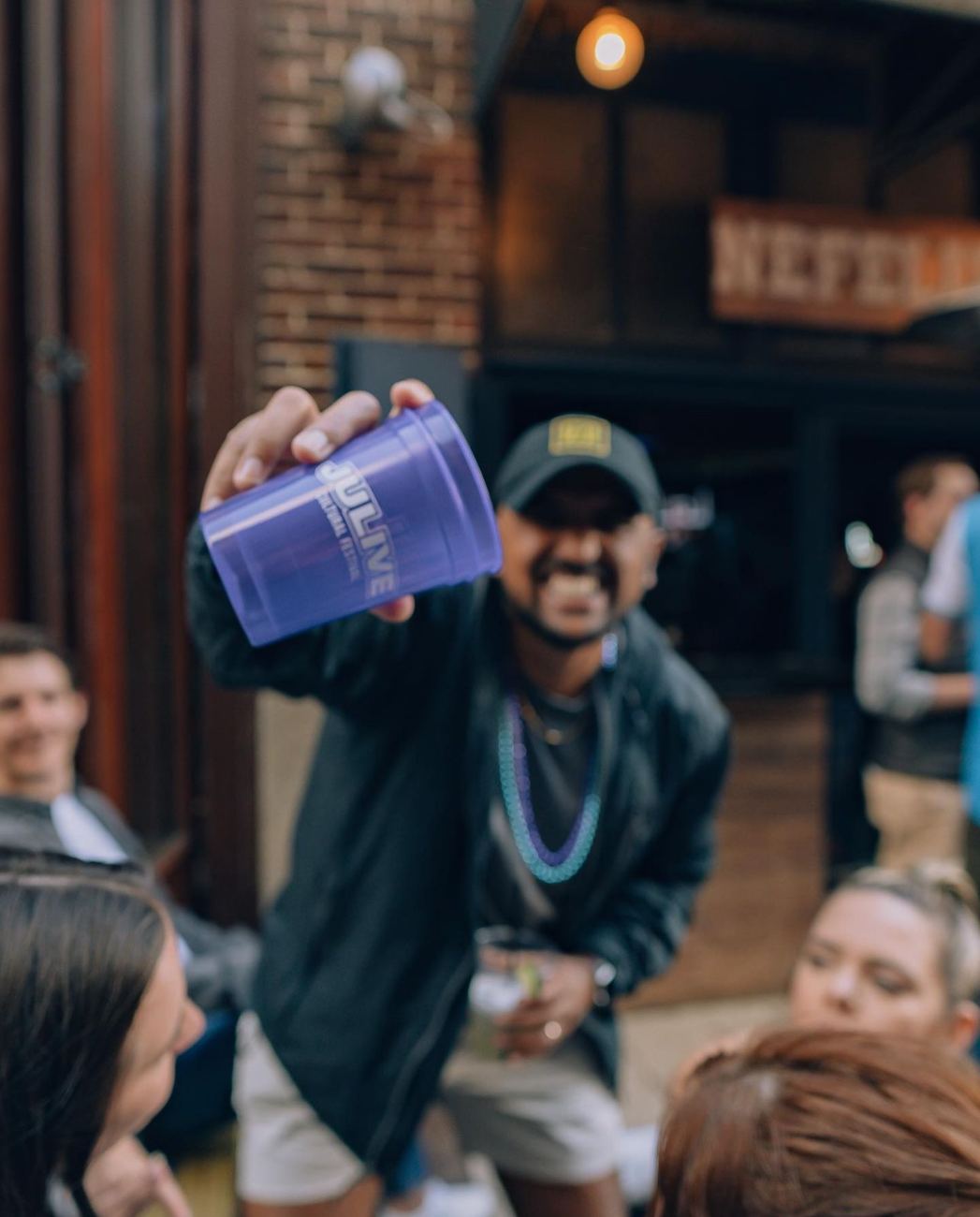
Ton of Visions built a platform for national artists, local artists, and local businesses to showcase their talents, products, and services, with a greater purpose: scholarships for local students. I created the logo, the brand system, and the creative direction that carried it.
Overview
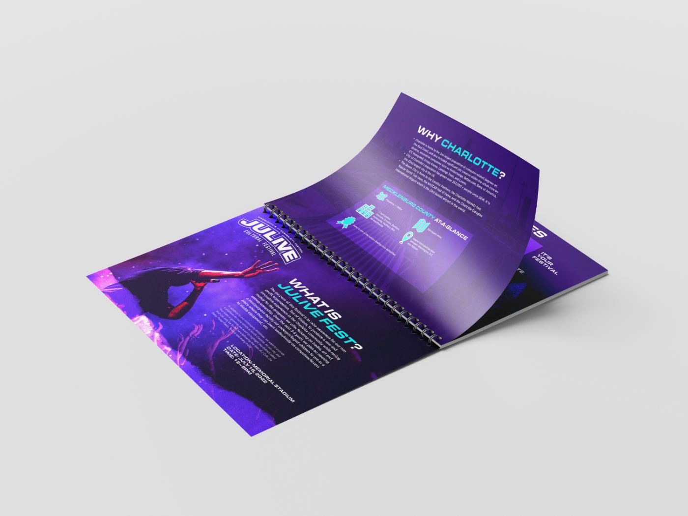
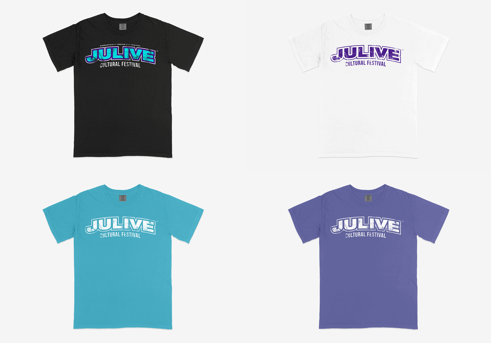
Hired by a local non-profit to name the visual voice of a first-year festival. I set the creative direction and focused on three anchors: logo, typography, and visual aesthetic. Everything else was built on top of them. A few print pieces; the bulk of the deliverables were digital.
Problem
Ton of Visions needed to attract sponsors and attendees nationwide, in a crowded summer. A first-year event was competing for attention against Dreamville, SXSW, Rolling Loud, and Broccoli City, all with years of brand recognition already banked.
Goal
Striking graphics were the floor, not the goal. The work had to translate to the audience and produce results: ticket sales, likes, shares, saves. Design measured in outcomes.
Julive was planned as an annual event, so the audit looked at festivals that had already earned that standing with our demographic. I studied how each one signalled scale, price point, and taste, looking at where the type sat between hand-drawn and corporate, how much the mark leaned on place, and what a first-year brand could credibly claim.
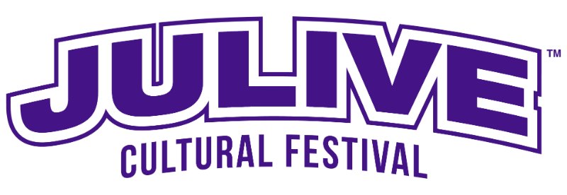
The pattern: the marks that traveled were wordmarks with one strong personality move, whether hand-cut, script, or block, and almost none of them were tied to a city's colors. That gap is where Julive went.
A homegrown festival through and through.
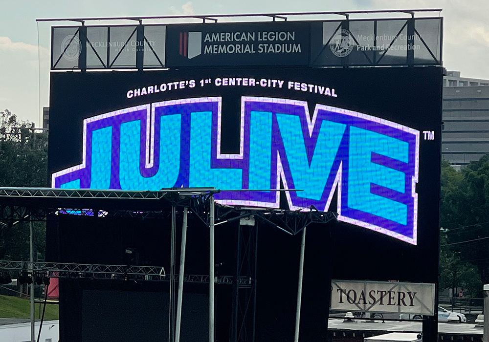
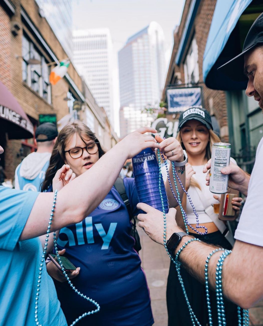
Teal and purple read as Charlotte. The Hornets made them the city's colors, and Charlotteans were a large share of the target audience. The skyline is just as recognizable to natives. I leveraged both to build awareness and familiarity at the same time. Strict deadlines meant leaning on proven strategy over experiment in every decision.
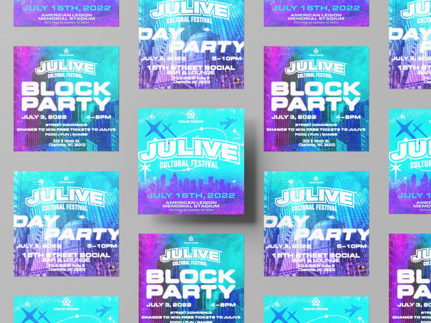
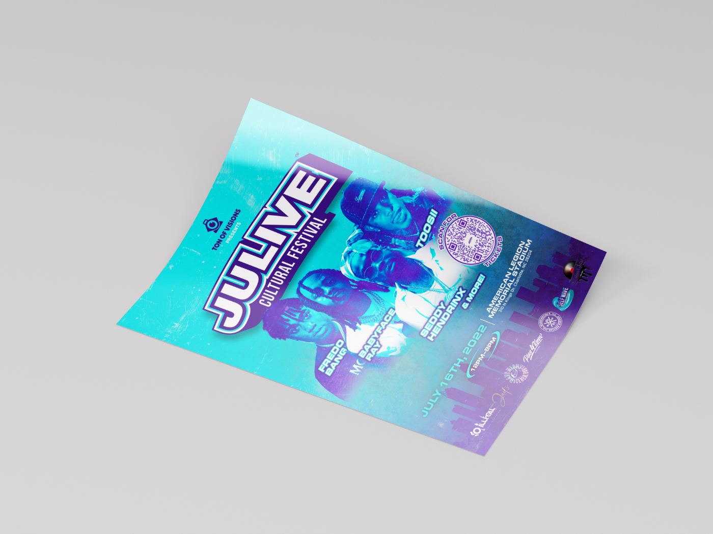
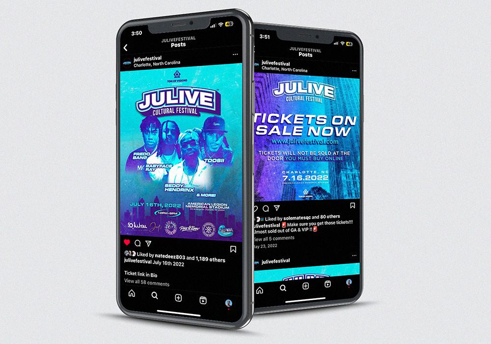
Research before aesthetics.
Before designing a single visual I studied what made other festivals feel aspirational: Dreamville, SXSW, Afropunk. That analysis shaped every color, type, and layout call. The teal and deep purple weren't preference; they came from understanding what this Charlotte audience needed to feel represented.
Design has to earn its results.
$15,000 in sponsorship, three global sponsors, and ticket sales that validated the direction. That link between a design decision and a real-world outcome is the part I carry into product work.
Brand work is UX work.
What the poster communicates in three seconds. How a ticket buyer feels seeing the campaign. Whether the visual language signals a festival worth attending. I didn't have the vocabulary then, but Julive taught me design is always about how people perceive, feel, and decide.