Designing the first mobile home for a brand-new women's pro basketball league.
The UPSHOT League tipped off its inaugural 2026 season with four teams, but no unified app. A fan who wants to catch a game may have to search across four different team apps and social feeds to answer three simple questions: when is it, how do I watch, and how do I get tickets? I designed a concept app to close that gap.
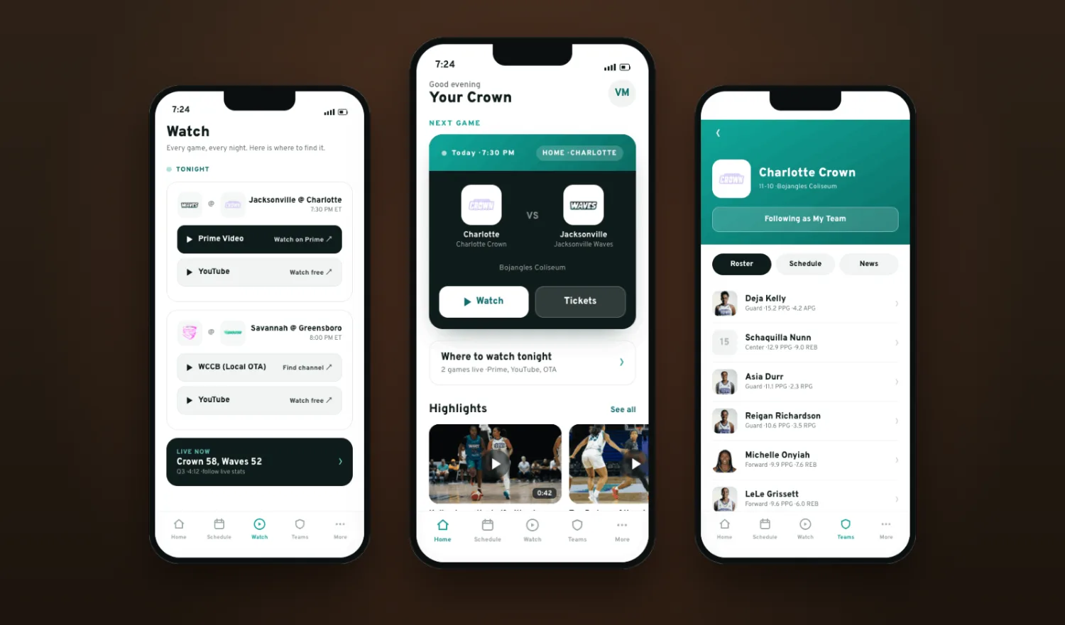
The right moment to convert curiosity into fandom.
Timing made this worth doing. The league launched with a diverse media plan: YouTube as the primary live home, Amazon Prime, and local over-the-air broadcasts across its four markets. Momentum is building right now, and the Charlotte Crown in particular is drawing attention and attendance. A well-designed app could convert first-time curiosity into committed fandom at exactly the moment the league needs it.
The four founding teams, Charlotte Crown, Greensboro Groove, Savannah Steel, and Jacksonville Waves, each seem to run their own online/ social presence. Baltimore and Nashville are set to expand the league in 2027.
Casual, first-time fans need a fast, single place to confidently find where to watch and how to buy the right tickets, because today that lives across a static site and four separate team apps and feeds. The fragmentation can cause missed games and abandoned purchases at exactly the moment a young league most needs to convert the curious.
Four methods, cross-checked against each other.
I worked research-first, so findings could be triangulated rather than resting on a single source. Because this was self-initiated, I recruited real fans, ran real interviews, and grounded every design decision in something a participant actually said or did.
That last pair mattered as much as the feature requests. This is a casual-first, light-user audience, which made simplicity not a nice-to-have but a design constraint.
Every theme, pushed to a "so what" and a design response.
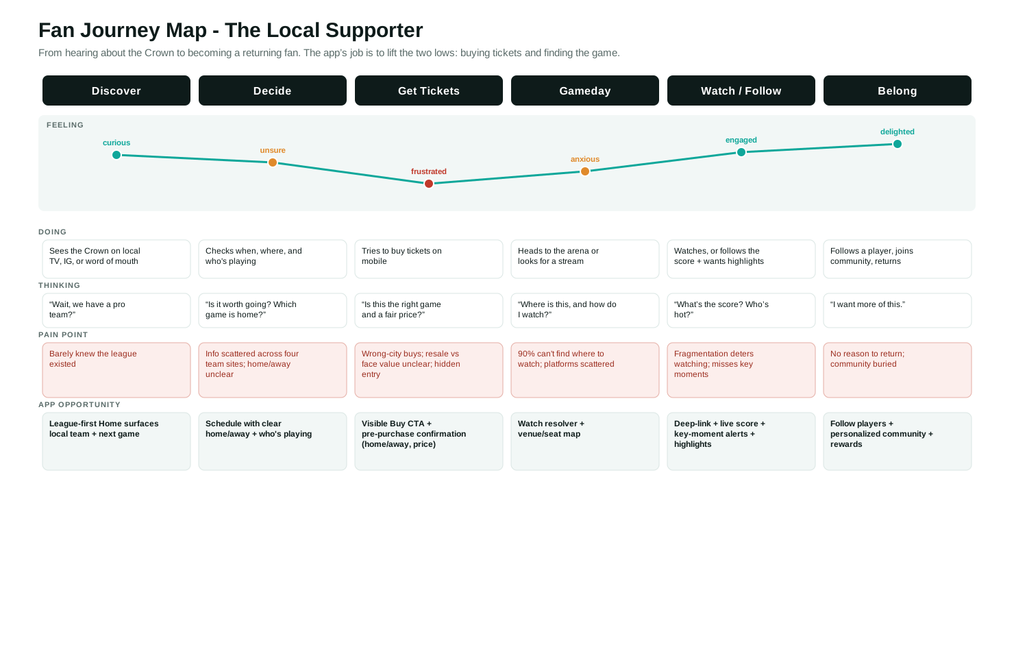
Broadcast is split across YouTube, Prime, and local TV. Even an engaged fan said the scattered platforms "deterred me from watching sometimes." Response: a dedicated Watch destination that resolves tonight's game to the right platform and links out.
One participant had a previous experience with the Charlotte Hornets wherein she bought tickets to a game ten hours away because the third-party app never made clear it was an away game. Another couldn't tell resale from face value on existing mobile apps. Response: a ticketing flow whose job is confidence: clear home/away labeling, a visible entry point, and a pre-purchase confirmation.
With 53% rarely using sports apps and an interviewee who said "if it seems too complex, then I'm done," the app has to stay clean and scannable.
Each team runs its own site, so the fragmentation is literal. Response: a league-first app with a personal "My Team" layer.
Behind-the-scenes content was the second-highest frustration, and fans wanted to follow specific players. Response: highlights, a player spotlight, and follow-a-player.
A participant with no kids wanted adult events like industry nights, not clinics. Response: a community section that personalizes by profile.
I updated my priorities three times as evidence came in. That's the part I'm proudest of.
I assumed the league had no rankings, because a social post said so. Checking the live product, I found a standings page. The honest reframe wasn't "drop rankings" but "keep standings, de-emphasize them to match the brand."
I assumed live stats would be impossible for a new league. It actually runs on a sports-data service (Airplai), which made stats, standings, and final scores feasible after all. I had to re-validate priorities against real infrastructure, not just user demand.
I cut a prediction-and-rewards feature after my first interview, where an older fan rejected it. Three later interviews showed I'd misread the signal: fans didn't reject rewards, they rejected gambling. So I re-scoped rather than reinstated: a non-wagering rewards layer tied to merch, experiences, and local sponsor promotions.
Popularity alone does not set priority.
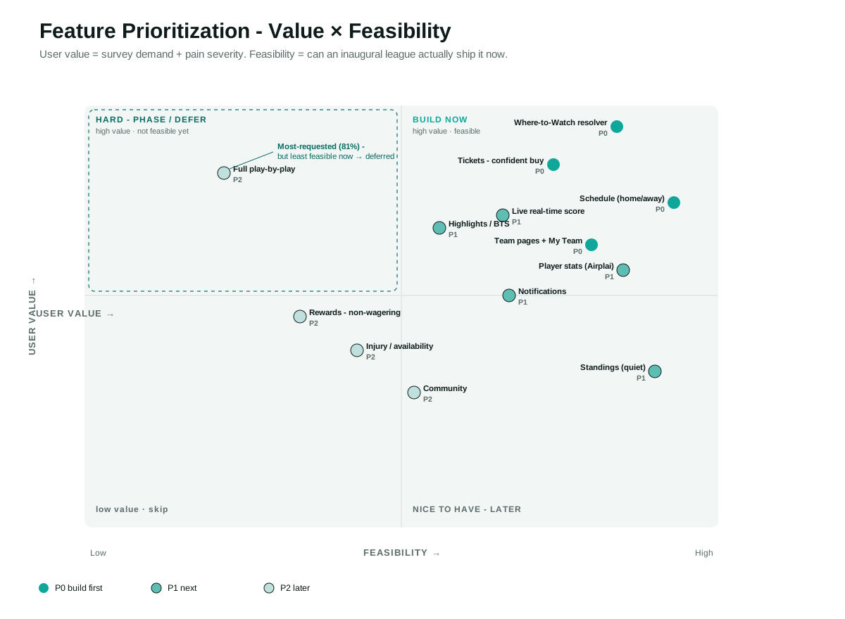
I ranked features on three questions: how much people want it (demand), how much its absence hurts (pain), and whether a first-year league can actually ship it (feasibility). My most-requested feature, full play-by-play (81%), sits far to the low-feasibility side, so it deferred. Meanwhile the feature that best kills the top pain, where-to-watch, is very buildable.
One league, four team identities, one app.
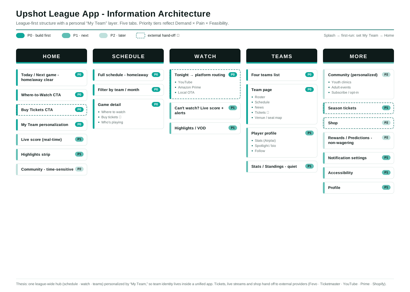
The IA resolves the core puzzle: a league-first app (one schedule, one watch hub, all teams) with a "My Team" setting that personalizes Home and unlocks a rich team page. Team identity lives inside a unified app, exactly what team-only apps can't offer.
The structure is a lean five-tab bottom nav, modeled on the G League app rather than the sprawling NBA and WNBA apps: Home, Schedule, Watch, Teams, More. Tickets, live streams, and shop hand off to external providers (Fevo, Ticketmaster, YouTube, Prime, Shopify), which the IA shows honestly rather than pretending to own.
From a word dump to nine screens.
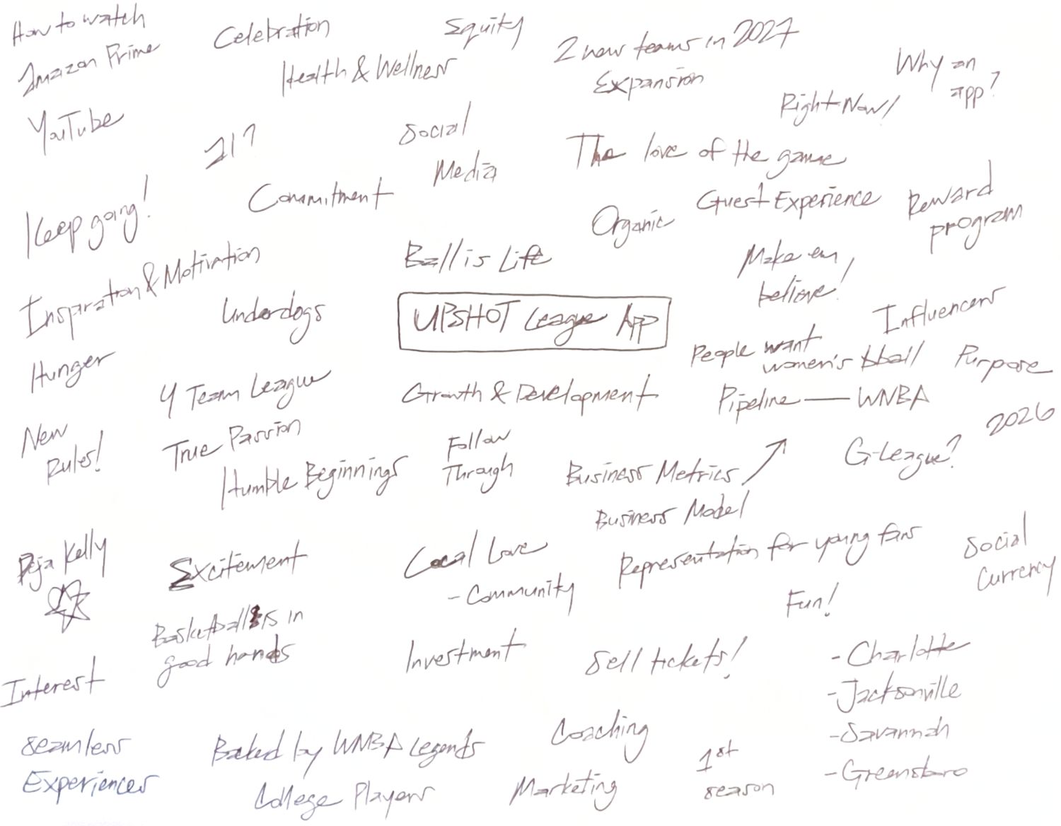
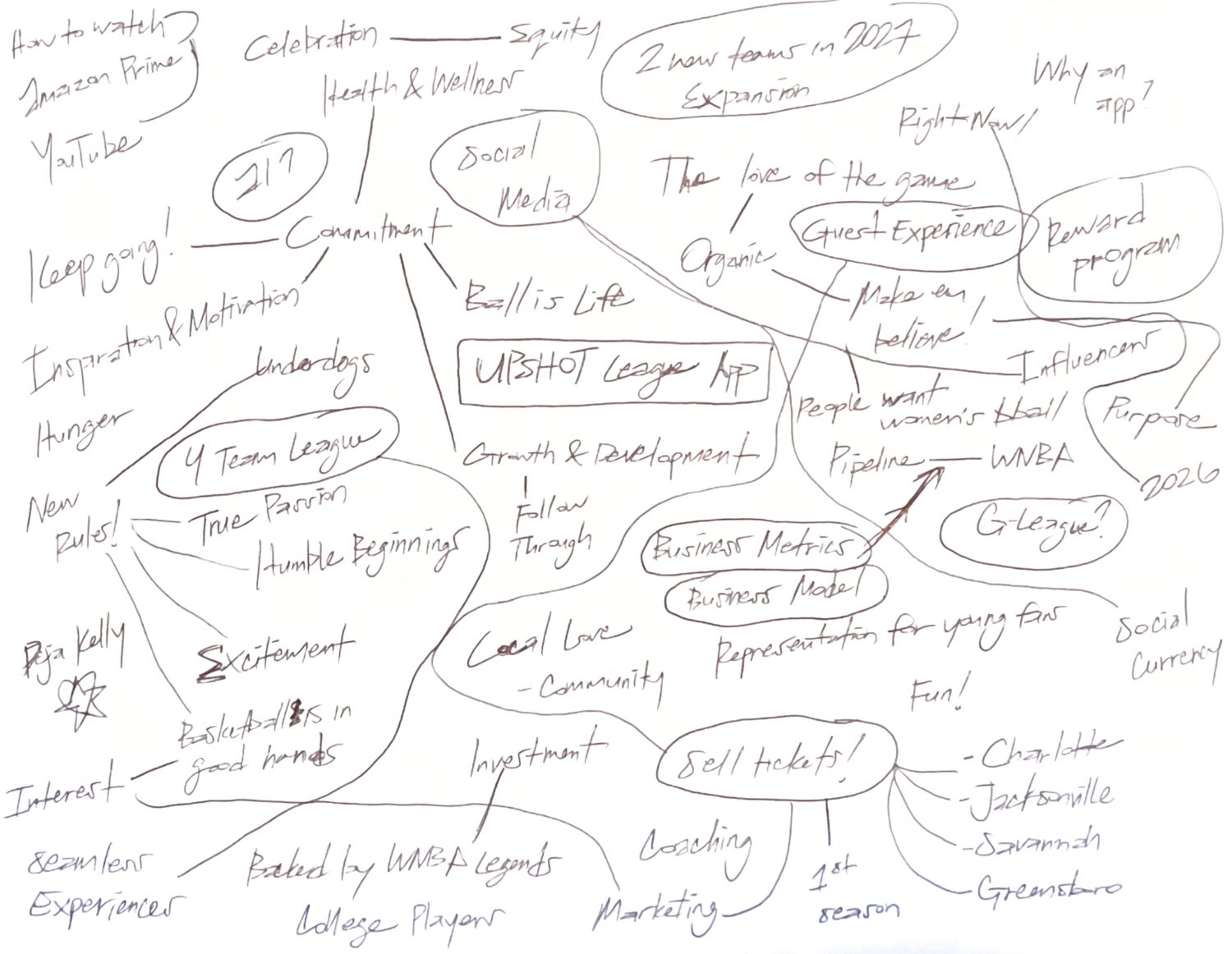
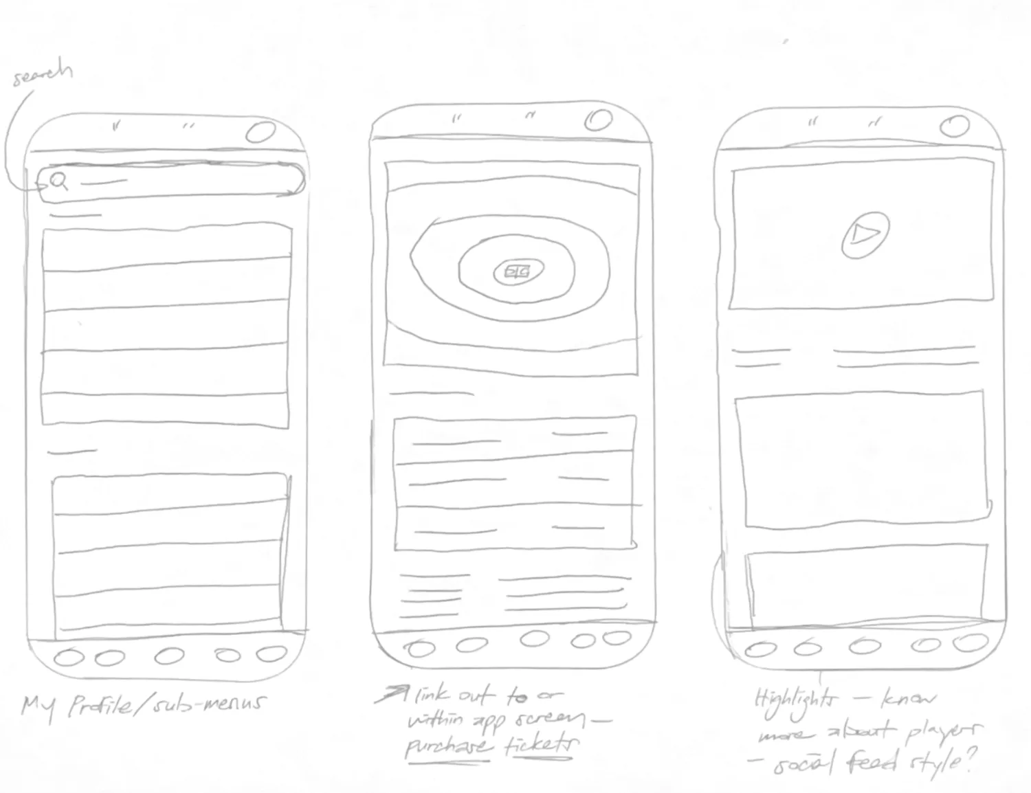
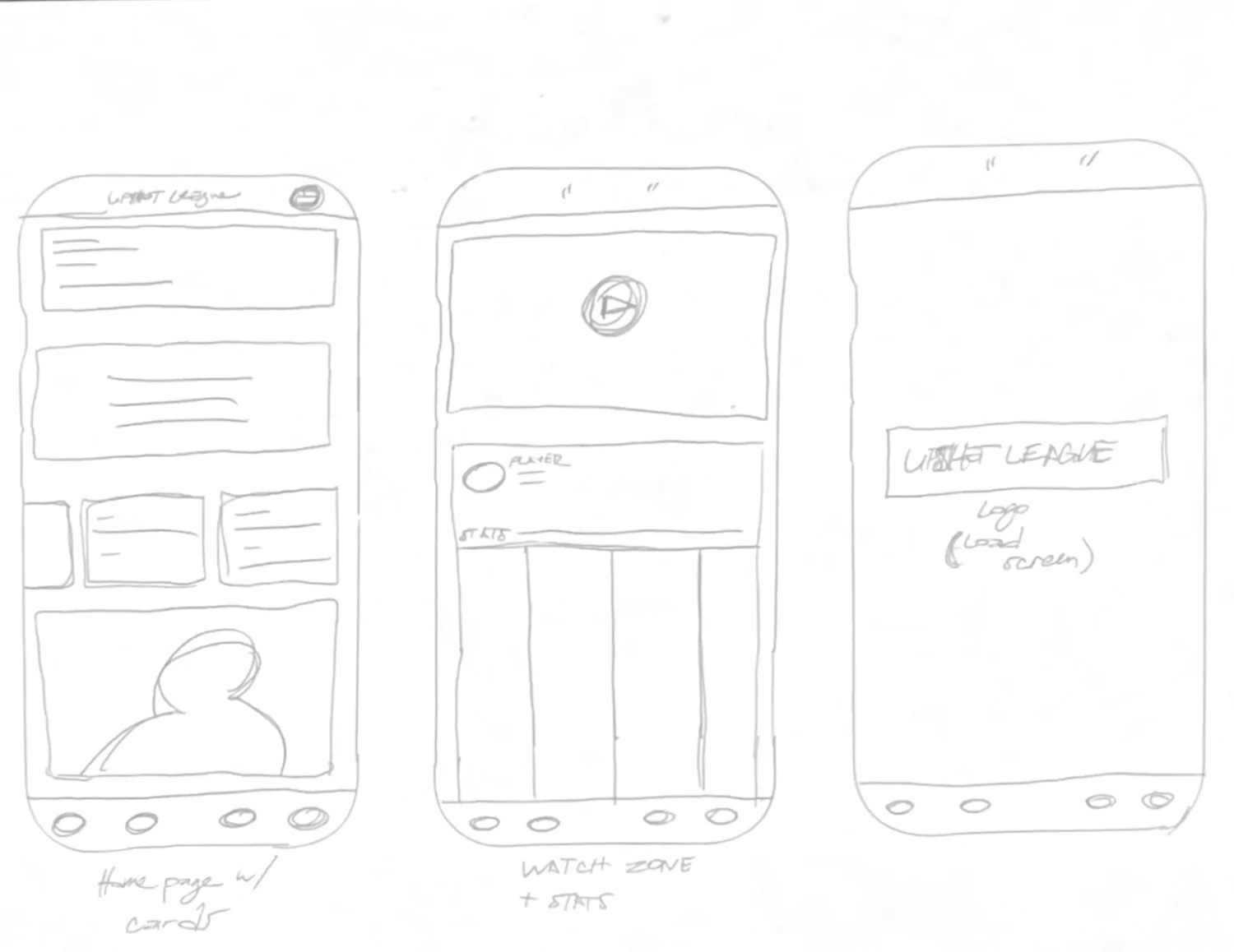
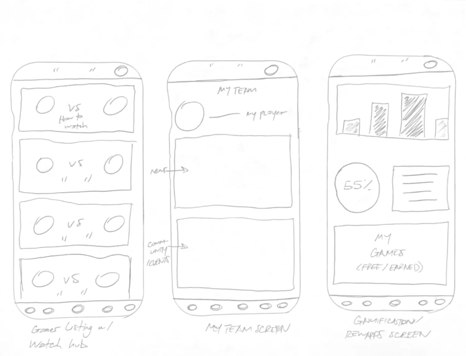
I ran a timed word dump that grew into a mind map, then a Crazy Eights sprint, then nine screen sketches. Several Crazy Eights seeds became real features: a tiered reward system, a player spotlight, and the college-to-Upshot-to-WNBA pipeline idea. The nine sketches mapped almost perfectly onto the five-tab structure and became my low-fi wireframes.
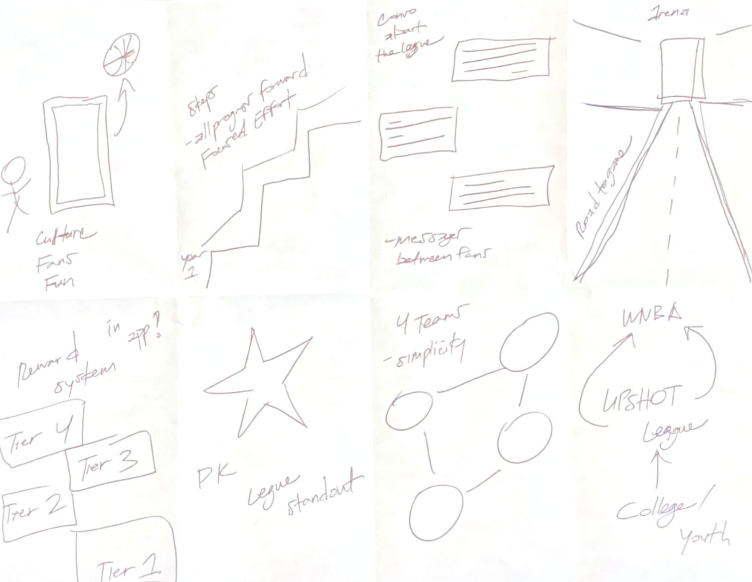
The sketches mapped almost perfectly onto the five-tab structure (home, watch hub, my team, ticketing, and the gamification layer) and became my low-fi wireframes.
Two hero tasks, diagrammed tap by tap.
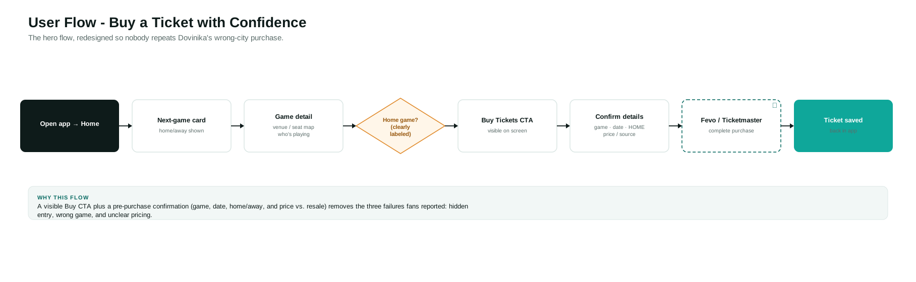
This flow builds in the confirmation step that would have prevented the wrong-city purchase one participant described: a visible Buy CTA, then a pre-purchase confirmation of game, date, home/away, and price versus resale, before handing off to the provider.
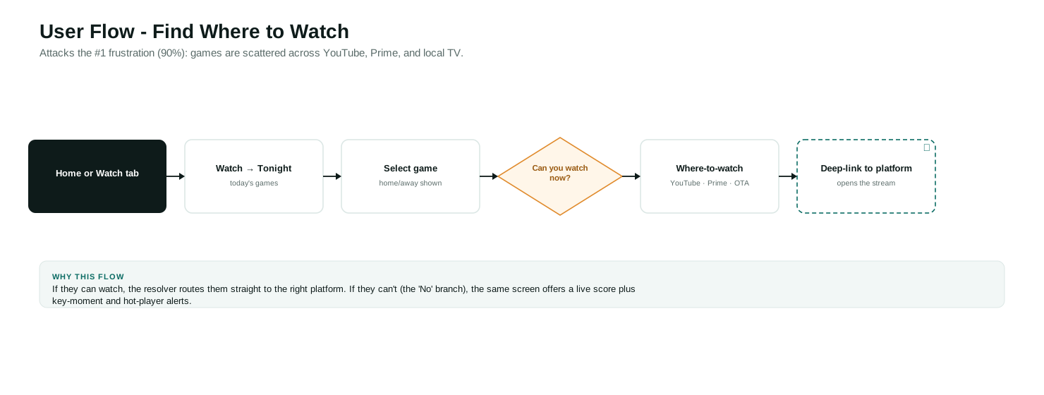
This flow attacks the 90% top frustration. If a fan can watch now, the resolver routes them straight to the right platform. If they can't, the same screen offers a live score with key-moment and hot-player alerts.
From wireframes to a working app.
The low-fi sketches and flows became a high-fidelity, tappable prototype: the five-tab structure, the watch resolver, the ticketing confirmation, and the “My Team” layer, all live. You can open it and walk the two hero tasks end to end.
I built it with AI assistance, Claude, used deliberately as an accelerator. Every screen, interaction, and IA decision on it is mine, drawn directly from the research on this page; the tooling just shortened the distance from decision to artifact. I prefer augmentation over autonomy: AI to move faster, a designer accountable for the outcome. The honest next step is putting it in front of real fans.
- The survey sample is small (21) and skews 25–34, so findings are directional, not statistically significant.
- All four interviewees lean casual/newcomer, and two don't follow the league, a fit for the "convert the curious" thesis, but light on die-hard power users.
- Ticketing is a multi-provider hand-off, so the app routes to Fevo or Ticketmaster rather than selling natively.
- True in-app streaming is unlikely due to broadcast rights, so Watch routes and deep-links rather than embedding streams.
- Maya, the aspiring-athlete persona, is kept as a brand-aligned proto-persona, not validated by this sample.
Treat a plan as a hypothesis.
Two lessons carry forward. First, prioritize on pain and feasibility, not just raw demand: the most-requested feature isn't always the one that helps most, or the one you can actually build. Second, the moment reality or new evidence pushes back, update the plan. The three pivots in this project taught me more than any single research finding did.